MyJourney Health - Bridging Healthcare Gaps with a Dual Sided Platform for Patients and Healthcare providers to Manage Cancer Journeys
The Canadian healthcare system has faced challenges in integrating digital solutions to enhance its efficiency and effectiveness with handling cancer care. MyJourney aims to improve breast cancer care management through a dual-sided application for healthcare providers and patients.
Role
UX/UI Designer
timeline
3 months (Dec 2023-Feb 2024)
core responsibilities
User research, product strategy, visual design and project management
Overview
Context
1/8 Canadian women will be diagnosed with breast cancer in their lifetime (Canada, 2023). MyJourney is a dual-sided app that offers a web application for healthcare providers and a mobile app for patients to improve cancer care management.
MyJourney is a pilot program ran out of North York General Hospital and is in part funded by the Ontario Centre of Innovation in an effort to adopt digital solutions to improve Ontario breast cancer care.
My role primarily focused on the web application for healthcare providers and is the focus of this case study. I conducted user interviews with healthcare professionals, and delivered three features to address the pain points uncovered in the research.
Goals
Patients ➝
Improve cancer journey communication
Healthcare providers ➝
Consolidate cancer journey information in one platform
Problems
Information overload
🤯
Cancer journey is fragmented across multiple systems
🧩🧩
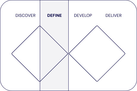
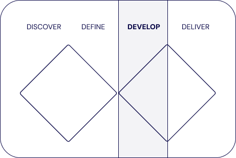
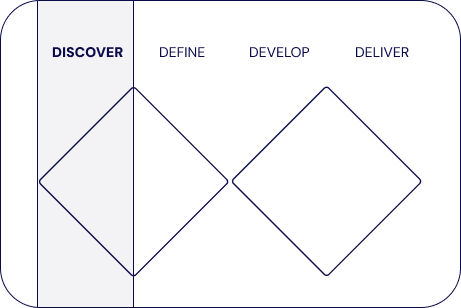
Process
Discover
Start with Problems, Not Ideas
Before jumping into the solution, I wanted to fully understand how the healthcare worker completed their workflow currently.
In this step I collaborated with the Product Manager to create a set of interview questions:
I then conducted 7 healthcare worker interviews at the Breast Diagnostics Centre at North York General Hospital. The main control centre for navigating cancer treatment
Distilling interview insights
To distill the insights uncovered during the interviews, the Product Manager and I created an Empathy Map and User Personas. These artifacts acted as our north star for the product strategy where we outlined product features and the order they would be prioritized.
For the full interview script and responses, click here
Empathy map
Themes emerged across the participants interviewed. This information is displayed visually using this empathy map.
User personas
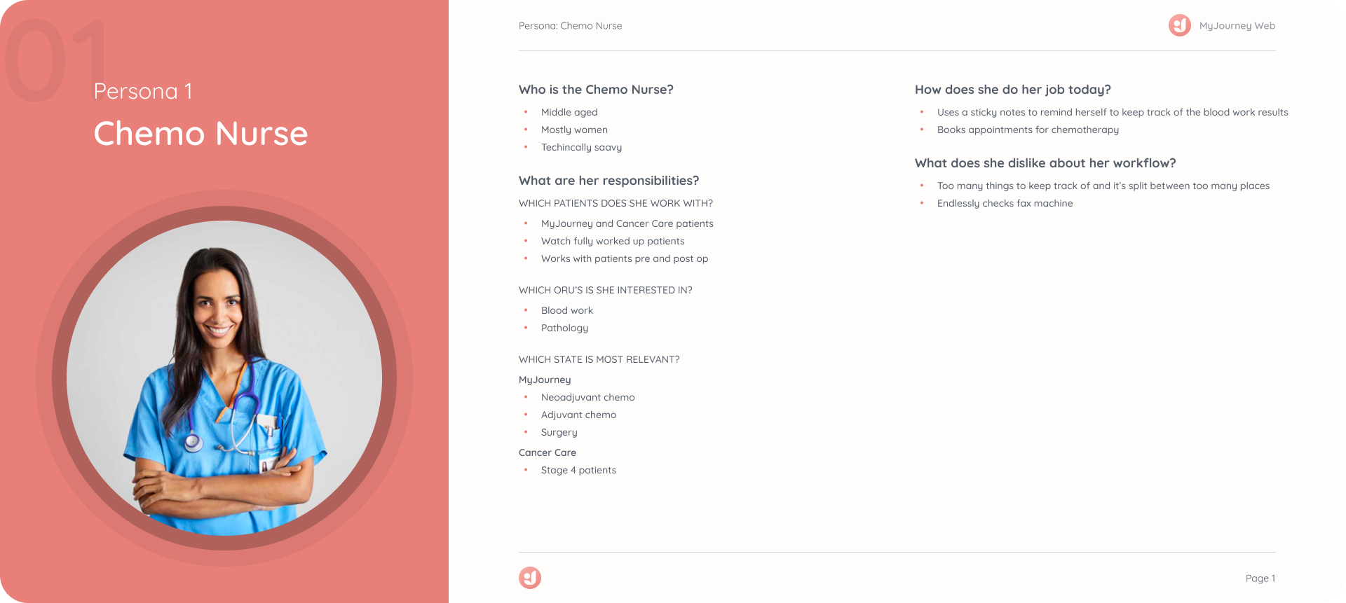
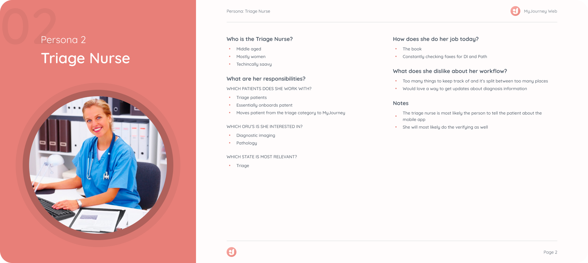
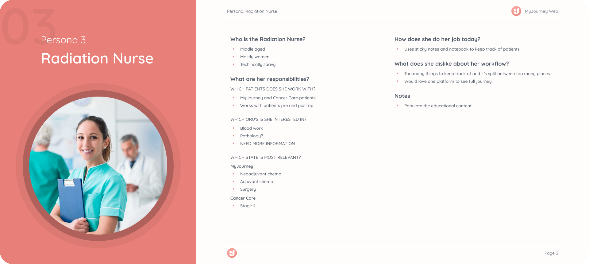
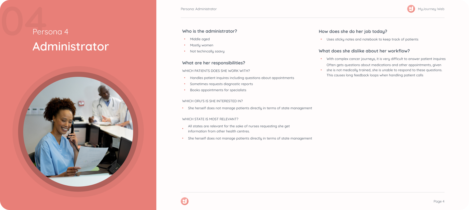
User personas were a very important step of the design process because during discovery, we uncovered 4 different roles at the Breast Diagnostics Centre. Each have a different role to play during the cancer journey and would request different features.
Define
Main pain points
1
Cancer journey is fragmented across platforms
2
Accessing results is done via fax or manual inquiry
3
It’s difficult to keep track of tasks that need to be done in the future once a document is received
The Design Challenge
How can I design a solution that improves the workflow of all four nurses, to better manage breast cancer journeys?
Design Strategy
One thing is certain: consolidating all of the patient appointments in one place is beneficial for all nurses.
After consulting with the development team to see if consolidation was possible, the product team learned that it will be a large back end development project. To make this a worth while project, other features should be built on top of these efforts.
Develop
Designing things right
By collaborating with developers early in the design process, I ensured that less problems would arise during implementation in addition to discover technical limitations.
Three Phases of Development
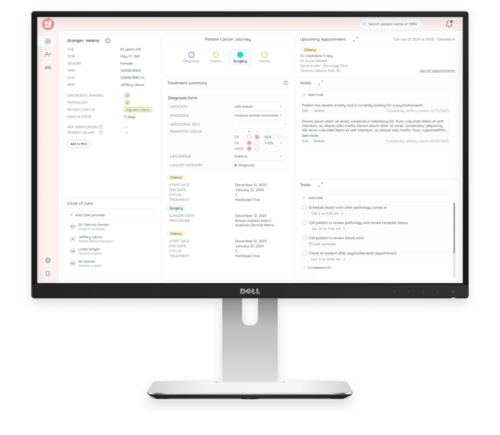
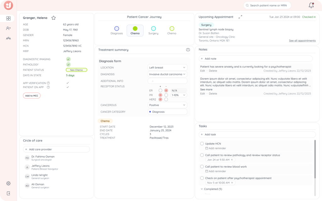
The most fundamental component of this project was to ensure that appointment and diagnosis information could be consolidated without nurses manually entering data.
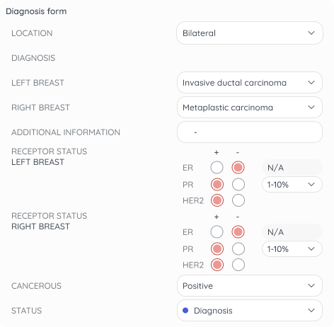
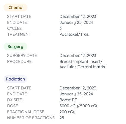
Phase 1: Diagnosis & Treatment Summary
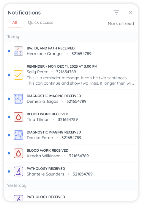
Phase 2: Notification Centre
Building off of the development completed in Phase 1, a notification centre was created in phase 2 to notify nurses of important results.
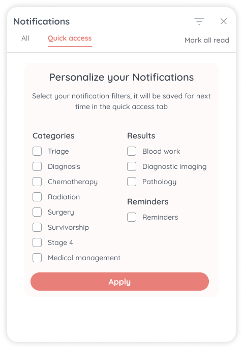
The Quick Access tab allows the nurses to tailor their notifications based on their work responsibilities.
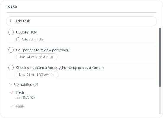
Phase 3: Tasks
Replacing scattered sticky notes! An important note about tasks, is that the prioritization of the phases of development build on top of one another.
With the functionality of the notification centre, we as the product team wanted to maximize the functionality. To do this, we added a reminder feature that was added to tasks.
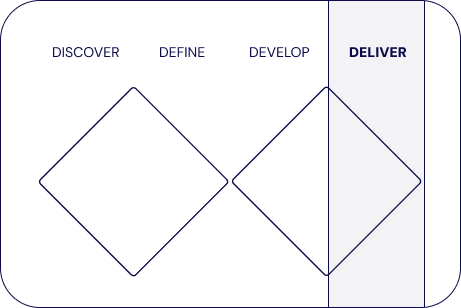
Deliver
Making sure that the final product makes an impact
A Google form link was given to the nurses to provide feedback to ensure that we met their expectations. We gained valuable insights for iteration.
Iterations
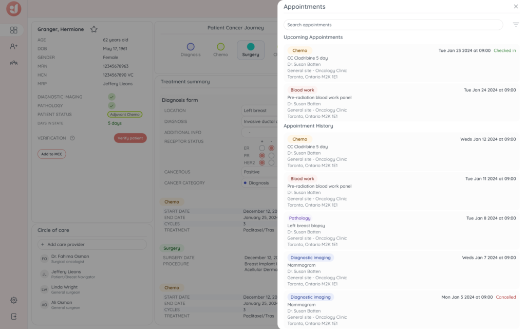
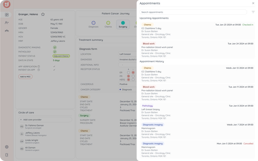
Appointment expansion
A Google form link was given to the nurses to provide feedback to ensure that we met their expectations. We gained valuable insights for iteration.
The backend functionality was expanded to include if a patient had checked in or cancelled their appointment. This functionality was key in helping the nurses anticipate when a result would be received. Minimizing feedback loops and resulting in enhanced efficiency when booking important cancer related treatments.
Future directions
From the nurse feedback, we also identified an area for opportunity: the ability to send surveys to the patient automatically based upon where they are in their cancer journey. For example, radiation and chemotherapy patients are given a pain assessment after each does of medication.
Additionally, this information is important to the Ministry of Health, particularly overall satisfaction of care received. Moreover, reporting of all statistics related to reaching survivorship is key for improving Ontario’s cancer care programs.
